No matter if you’re a local or national political candidate, in a democracy, being elected into office requires exposure. The more prestigious the office, the more exposure is often needed. Aside from television appearances and social media presence, the major way of getting exposure is through election material – often in the form of posters. These posters can take many different creative forms, but often they include a portrait and a message. Just think of Barack Obama’s famous “Hope” poster and “Yes we can” slogan, both of which helped him clinch victory in the US elections in 2008 – all through portrait and message. However, how can we be sure that the text and image on election posters achieve this purpose of bringing voters to the polls to vote for you?
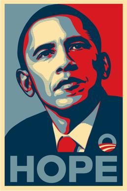
Image: Barack Obama’s famous “Hope” election poster
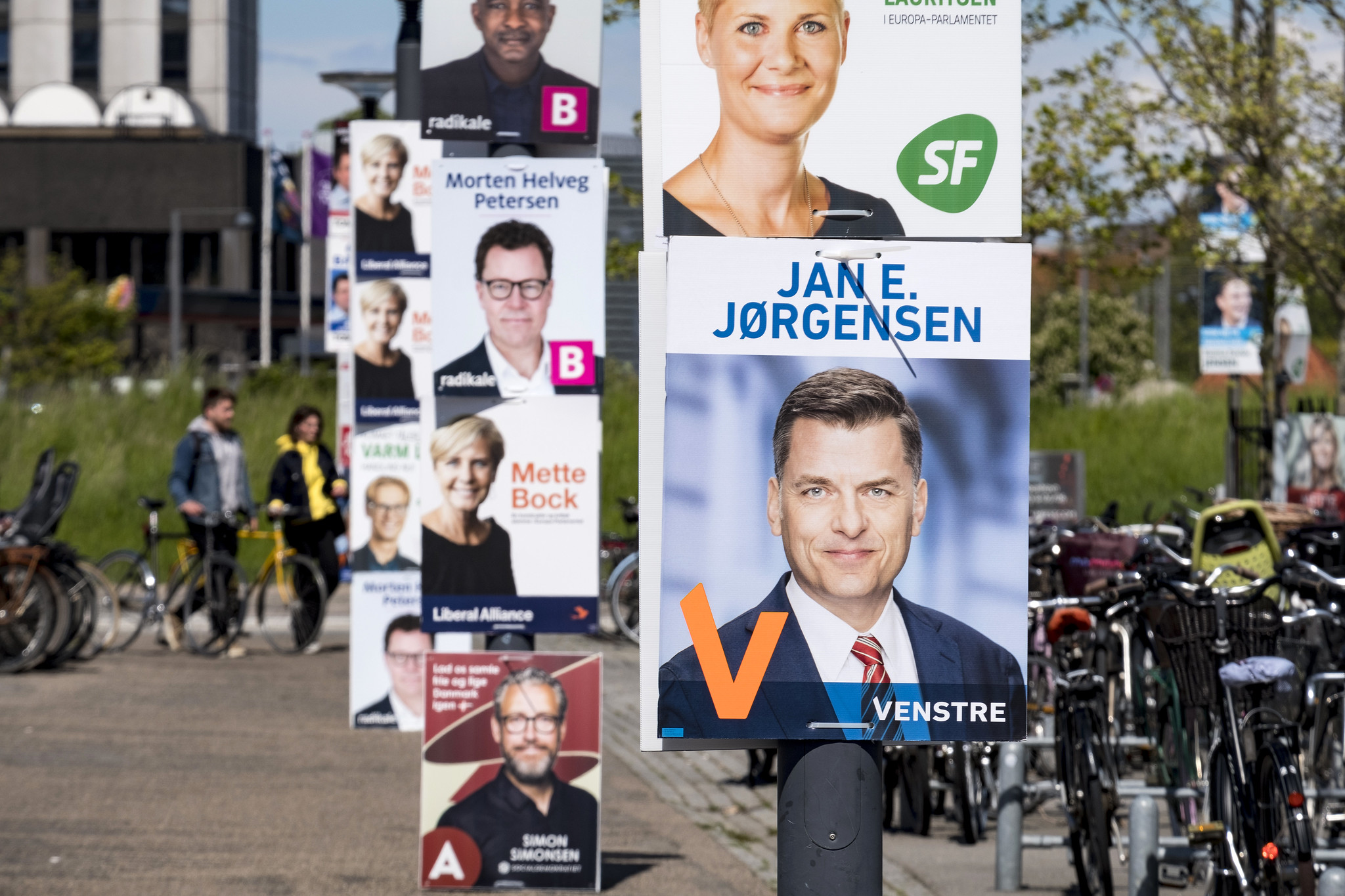
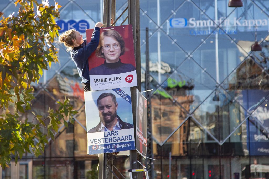
Election posters in Denmark
Elections happen all over the world many times a year. Globally they follow the same general framework, insofar that the election is democratic. Local elections are always a good gauge of what any given national political landscape looks like at the moment of the election. November 14th, 2021 was local election day in Denmark. The town halls and regional council offices all over the country were filled with new and familiar faces of the people who won the trust of their constituents.
For over a century, election posters have been a ubiquitous part of all Danish elections. In the early days of use, they exclusively focused on the assumed needs of the public, but over the decades they have morphed into an outlet exclusively for the individual politician, and they usually follow the same compositional guidelines. A subtly touched-up image of the politician in question sporting a reassuring and winning smile is supported by an equally reassuring message that can be digested in the time it takes to bike past the streetlight on which it hangs.
Election posters work – that’s the consensus – and the decades of continued global use are a testimony to the longevity of the format. However, claiming that the election posters work owing exclusively to accepted practices is a textbook example of correlation not equaling causation. Also, with the sheer volume of posters and the ensuing fight for space, it is high time to evaluate election campaigns by measuring the efficacy of the election posters.
Re-checking the concept
Copenhagen-based communications and PR bureau Operate A/S decided to have a look at how election posters fared when subjected to the technology of the 21st century. A local TV station aired a segment about the study, which you can see at the end of this article (the segment is in Danish and can be seen at the end of this article).
The study question was simple: How do voters actually react to election posters when our non-conscious reactions are measured, and the participants are not asked outright? Operate showed 28 participants an array of posters from different candidates and parties all running for election in Copenhagen Municipality while using sensors to record their eye tracking (screen-based), facial expressions, and micro sweat activity (galvanic skin response), all run through iMotions.
Additionally, all respondents were asked to answer a questionnaire about their political standpoints and affiliations before they started the study.
The Findings
This short study brought some genuine insights. As stated earlier, the consensus is that election posters work, and that may well still hold, but there are things to learn if you want to stand out from the throng. According to the study, respondents respond well to messages that have humorous elements, are a bit different, or make you pause to think about what you just read while still being quickly digestible.
Another interesting finding, that might make a few career politicians sweat a little, is that respondents react very positively to what they identify to be a genuine smile. Subconsciously we humans are great lie-detectors, and when someone does not seem earnest or genuine in their representation, we notice it almost instantaneously. Facial Expression Analysis software can pick up the difference between a “genuine” (scientifically named a “Duchenne Smile”) or a “false” smile (sometimes referred to as the Pan Am smile). It does so by measuring the movement of the zygomaticus major, which is located between the corners of our lips and the upper part of our cheeks, and simply put, it controls the way we smile. If you want to know more about how to discern between different types of smiles, see our blog on the subject here.
Additionally, if politicians hope to use election posters to draw people into voting for a new party and away from their existing political standpoint, they might come up a bit short. Respondents showed higher levels of positive attention for candidates from the party they already identified as supporting.
In terms of the overall composition of the poster, respondents showed higher levels of frustration, or brow-furrow, when a poster featured a text longer than a slogan. This might have something to do with the inherent limitation of a poster, and therefore if a candidate would like to try and swing votes with a lengthier text, another medium should be preferred.

Putting the findings into action
Operate made three actionable findings during the short study. The first one is that the main area of attention is the face. This might not be surprising given that the vast majority of election posters feature a candidate’s face. However, this fact makes standing out more important, and that can be done by having an earnest smile, for example.
Cynical people will say that voters are fickle and have unfeasibly short attention spans. The second finding of the study indicates that this may be true – at least when people are presented with campaign materials. Since respondents showed increasing frustration the longer the messages on the posters were, candidates should opt for short and sweet messages, not longers ones that are harder to digest in a hurry.
The third and final action that politicians can take is that a candidate’s name recognition tends to be much higher when their message and their name appear close together on the poster, and ultimately it is the name you have to remember when heading into the voting booth.
Globally applicable – Online
Even though this specific use case is very much set in both a Danish and a lab context, the measuring of engagement and emotional valence of election materials is an internationally applicable study template.
iMotions recently launched our new online studies platform, a cloud-based service, which is the perfect resource with which to create and run extensively scalable studies with respondents from all over the world.
iMotions Online is perfect for conducting image and video testing and paired with our survey tool, it provides the perfect platform for measuring the emotional engagement of voters across an entire country, continent, or if you want, the entire world.
To learn more about iMotions Online please visit our dedicated page here.