In late 2018, the iMotions marketing team embarked on a website redesign project from an assumption that we could do more to generate a better user experience on our website using iMotions software.
To explain the unknown by the known
iMotions is a software company that provides a platform and tools for human behavior research, but website visitors often weren’t aware of what this means. So how do you explain a category that’s new and unknown for many?
Human behavior research with biosensors is still on the cusp of common knowledge, so we face two challenges: both of articulating what this type of research entails, and also explaining the technical side of how the iMotions software helps researchers carry it out.
To help both of these aspects be communicated better, we wanted to improve our navigation structure, and make an emphasis on clear communication. This allows us to explain what we do in more simple and accessible ways (while also tackling one of the biggest issues we experienced with our website – high bounce rates).
With the redesign, we aimed to reduce complexity for visitors who don’t necessarily have a high level of behavioral research experience. Moreover, researchers in UX and Usability often ask us at iMotions for guidance on how to run user experience studies on parts or all of their website.
While every use case and study design are different according to your research questions, we wanted to take the opportunity to use and showcase the capabilities of the iMotions software for UX while redesigning our website–killing two birds with one stone!
We hope the below snapshot of how we hypothesized and reshaped the new imotions.com with data from biosensors can provide you with some insights for your own user experience studies. Of course, like any in-depth research, study design is paramount, and since we’re choosing to highlight only the most relevant findings, this should be taken just as inspiration.
The study questions
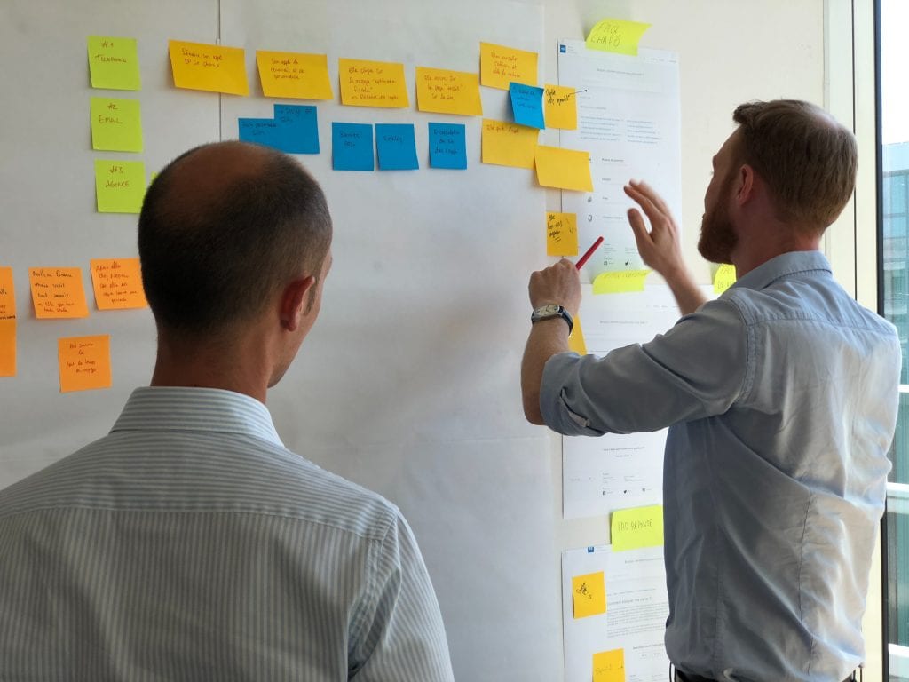
As a first step, we sat down together and looked at our site, noting down the things we wanted to change – and how to measure their effects. We deemed our messaging and layout as the most crucial areas for improvement, so we designed two research hypotheses to answer with biosensor data:
- A more intuitive layout on our homepage with dedicated sections will help guide users to a clearer understanding of what iMotions is, and how this kind of technology works in academia and business.
- Providing a more precise explanation of the benefits and value of iMotions will lead to a more positive website visit experience with straightforward paths for actions.
Additionally, we conducted focus groups with two groups of employees at iMotions and an external communications agency to balance the biosensor data with conscious responses – such as surveys and self-reporting.
We asked the groups to articulate our brand promise as they see it, and to describe iMotions in one sentence. This language helped to hone our messaging in language that would be understood and embraced by both experts and newcomers to human behavior research.
Collecting data with biosensors
To conduct data collection, we recruited respondents who each experienced two website exposures – one for our old site and one for a wireframe mockup of the new one.
While the participants read through specific pages designated for study, we recorded their psychophysiological reactions to the content and layout using biosensors. Specifically, we used eye tracking, facial expression analysis (using Affectiva’s engine), and electrodermal activity (EDA, also known as galvanic skin response or GSR) with a Shimmer device.
Eye tracking would provide us with valuable metrics of visual attention like heatmaps and fixations, while FEA and EDA could together give an indication of valence and arousal–from which we could derive the type of emotional reactions the site was eliciting.
Key results from the first set of stimuli on our old site
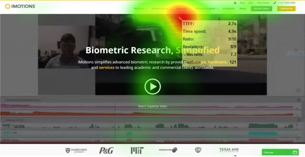
an aggregated heatmap of eye gaze on our old site
Diving into the analysis of the data from respondents looking at our old site, we found that certain data from the biosensors provided the clearest insights. Here’s what we found:
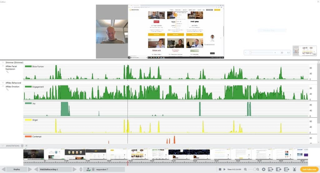
- Participants’ gaze hovered around the homepage menu, so we exported aggregate facial expressions and EDA data for those moments, to drill down into what emotions they were experiencing at that time.
- Negative valence from facial expression analysis was the most common on average, occurring 14% of the time (of the respondents who experienced this above the threshold of 10). Here’s one respondent’s replay: see that his brow furrow – which can be correlated with confusion – as well as anger were high as he explored the menu:
Mocking up a wireframe
We drew up a plan of action from these findings so that on our new site, users would be better guided with our communication and layout from the very start. It was clear that these both had to be improved on the front page to enable a better navigation, product understanding, and user flow.
The intention was to decrease frustration with user-friendly page interlinking, and by limiting the need for visitors’ eyes to travel through the whole menu to try to understand the key value propositions of iMotions.
When we had a wireframe with the concrete messaging and UX design we were happy with, it was time to run the same data collection process again – exposing our set of respondents to this new wireframe mockup of how our new site might look.
This set of results proved critical for two reasons: one, because they indicated what was improved about the homepage that we can highlight even more, and two, because some elements were not as attention-grabbing as we originally thought they would be.
Arousal and Valence from EDA and FEA
We first compared levels of emotional connection and arousal across the two sites to make sure that beyond tracking visual attention (which we detail in the next section), we understood what kind of reactions our homepages were actually eliciting at the nonconscious level. Combining electrodermal activity and facial expression analysis was the key here.
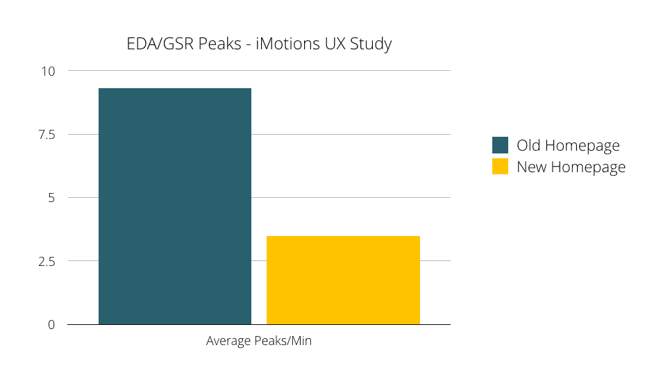
The average peaks per minute for EDA, as in the graph above, show that there was more arousal on our old site than on our new wireframe site. However, EDA peaks don’t indicate the positivity or negativity (i.e. valence) of an emotion, but suggest a change in emotional intensity (i.e. arousal). We therefore looked at the average time certain emotions were exhibited simultaneously, using FEA:
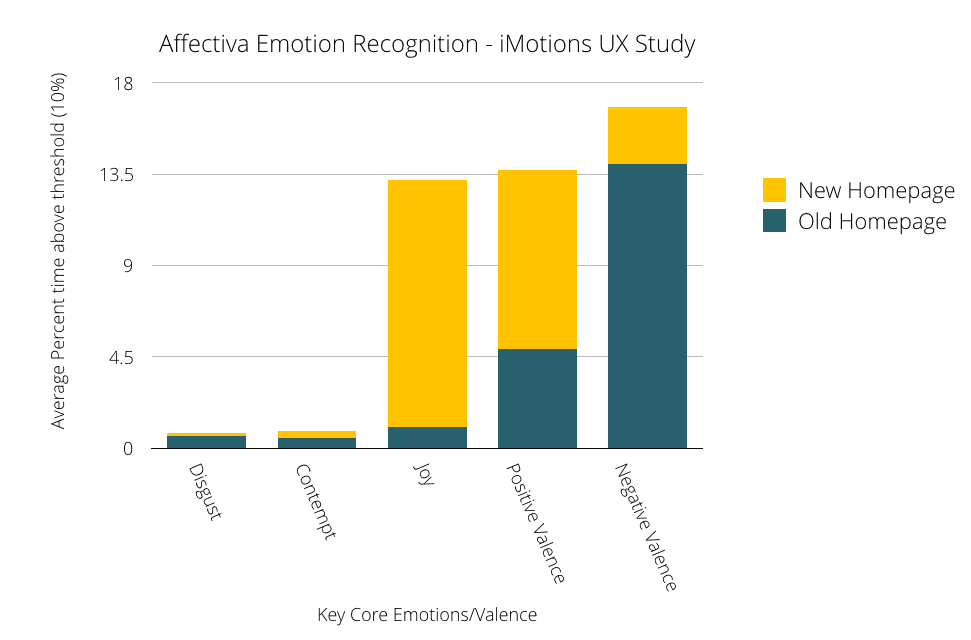
Looking at data from these two sensors together shows us that the arousal on our old site was more intense and largely negative, whereas on our new site, users on the whole were maybe less aroused (less disgruntled!) but more joyous and positive about the site.
Insights from eye tracking for new site
Finally, it was important to understand how users were navigating around the mockup of the new site so we could better optimize and guide their eyes to gather the information they needed, so we used iMotions to create eye tracking heatmaps of the users’ visual attention on the homepage and pulled out the fixation data.
We found that despite relatively equal amounts of text across the sections, fixations didn’t occur as we thought they would at the top of the site with our tagline and subtext, “Unpack Human Behavior with the world’s leading biosensor platform” (39, seen in image 1 below).
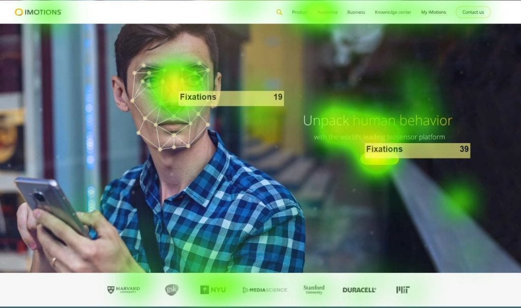
Image 1: top banner image & tagline showing the number of eye tracking fixations in the yellow “stickies”
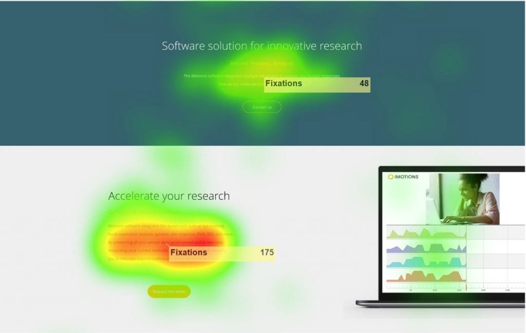
Image 2: Fixations in software description section
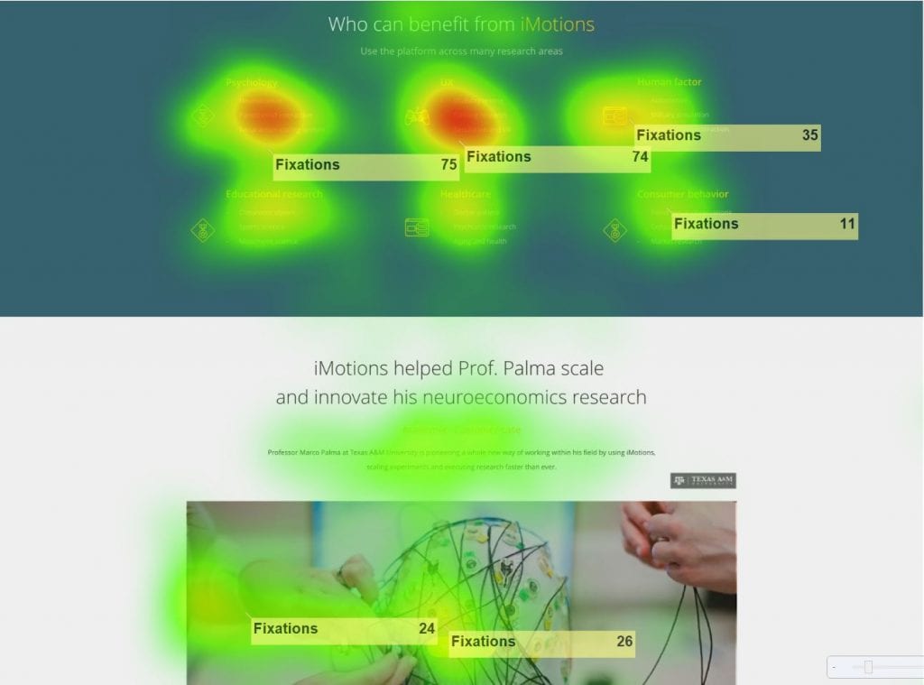
Image 3: Fixations in “Who can benefit from iMotions” section
Rather, more fixations occurred at the description of the software (image 2) and “Who can benefit from iMotions” (image 3).
Thanks to the eye tracking, EDA and FEA data combined together, we learned and iterated on our wireframe with the following additions, which led to the imotions.com you see today:
- We needed to spice up the first part of the site when people first land — so we implemented a banner video to emotionally and visually drive engagement and understanding of the different sensor solutions.
- We needed to accurately explain how the iMotions software helps research across industries to guide users to recognize their own use cases. This was thought to be due to our old site going too quickly into talking about the “what” without first indicating the “why” – so we created industry-specific pages that website visitors can use to quickly find information about human behavior research and iMotions in terms they recognize.
Conclusion
We hope that you can use this use case as inspiration for your own UX studies and that it provides a helpful blueprint for gathering biosensor data for website improvement – whether from a communication, navigation, design, or retrospective standpoint.
Not only was using iMotions software to conduct this study a great way for us to see the value of our own software in action, but it also helped us better put ourselves in our clients’ shoes so that we saw first-hand how iMotions can solve a wide set of UX challenges that our customers face.
For a deeper dive into how iMotions can aid in UX and Usability studies, check out our free, downloadable UX brochure here.