Table of Contents
Introduction
We’ve all heard the phrase “the best-laid plans of mice and men often go awry.” But what about the best-laid plans of marketers and product designers? As it turns out, they’re not immune to the whims of fate-or, more accurately, the unpredictability of the market. Picture this: a shiny new product hits the shelves with all the fanfare of a Hollywood premiere. The marketing campaign is dazzling, the press is buzzing, and everyone expects the product to be the next big thing. But then, something strange happens. The product flops, and the once-bright future turns into an embarrassing chapter in corporate history.
Why does this happen? More often than not, it’s because there’s a misalignment-a big, ugly disconnect-between the marketing message and the actual product experience. Imagine a kid on Christmas morning, tearing open a gift only to find socks instead of the action figure he was promised. That disappointment is what happens when consumers buy into the hype, only to find the product doesn’t live up to it.
And the consequences of such a mismatch? They’re not just limited to a few disappointed customers. Entire brands can be tarnished, stock prices can plummet, and companies can find themselves scrambling to recover from the financial and reputational fallout. A single product failure can shake consumer trust, sometimes causing damage that takes years to repair-if it’s even repairable at all.
In this article, we’re going to dive headfirst into some of the most memorable product failures of the past few decades. We’ll explore how marketing campaigns painted these products as game-changers, only for them to stumble (or faceplant) once they entered the market. We’ll examine what the press was saying at the time, how consumers reacted, and, of course, why these products ended up in the Hall of Fame for Bad Ideas.
But don’t worry-this isn’t all doom and gloom. We’ll also peek behind the curtain at how better market research and product testing could have saved these flops from themselves. Tools like iMotions Lab offer a way to bridge the gap between what companies think people want and what they actually do. By the end, you might just learn a thing or two about what not to do the next time you’re involved in launching a product. Or, at the very least, you’ll get a few good laughs out of other people’s missteps.
Let’s begin, shall we?
Case Studies of Notable Product Failures
Windows 8
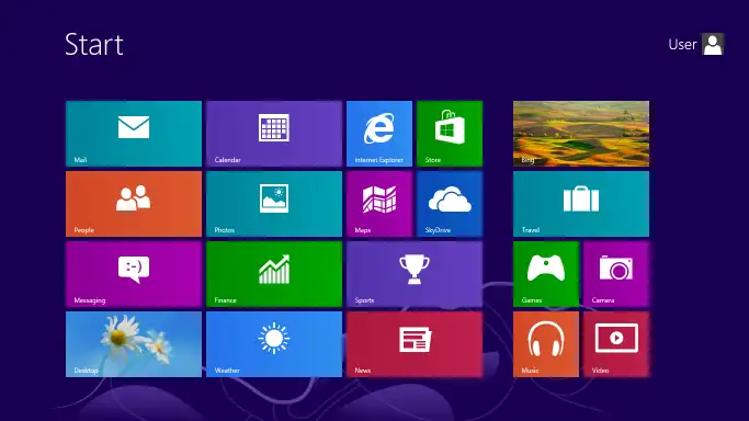
Back in 2012, Microsoft decided it was time to shake things up in the world of operating systems. Enter Windows 8, the company’s bold attempt to create a single operating system that could seamlessly bridge the gap between traditional desktop PCs and the rapidly growing world of touch-screen devices. The cornerstone of this ambitious plan was the new “Metro” interface, a tile-based, touch-friendly design that was meant to bring a fresh, modern feel to the Windows experience. Gone was the familiar Start Menu that users had known and loved for decades; in its place was a full-screen Start screen, filled with colorful tiles that dynamically updated with information.
Marketing Messaging and Press Reception
Microsoft wasn’t shy about touting Windows 8 as a revolutionary leap forward in computing. The marketing campaign was full of energy and optimism, showcasing the operating system as the perfect marriage of traditional desktop computing and the burgeoning tablet market. The message was clear: Windows 8 was the future, and it was going to change the way we interacted with our devices. Advertisements depicted stylish young professionals seamlessly switching between typing on their laptops and swiping through tiles on their tablets. The campaign screamed innovation and versatility.
The press, at first, seemed to buy into the hype. Many tech journalists praised Microsoft for taking such a bold step, with some even calling the new interface “visionary” and “refreshingly different.” Windows 8 was heralded as Microsoft’s answer to Apple’s dominance in the mobile and tablet space, and the company was poised to regain its foothold in the market.
Market Reception and Reasons for Failure
And then, reality hit-hard. The reception from actual users was, to put it mildly, less than enthusiastic. Almost immediately, complaints started pouring in from bewildered customers who found the new interface confusing and frustrating. Long-time Windows users, in particular, were baffled by the sudden disappearance of the Start Menu, a staple feature since the dawn of Windows 95. What was meant to be a slick, intuitive interface instead felt like a foreign landscape with a steep learning curve.
The problem was clear: Windows 8 tried to be everything to everyone but ended up satisfying no one. Traditional desktop users felt alienated by the touch-first design, while tablet users found that it still lacked the smooth, integrated experience offered by competitors like iOS. The disjointed nature of the operating system created a jarring user experience that failed to resonate with either audience.
Despite Microsoft’s attempts to patch things up with Windows 8.1-bringing back a semblance of the Start Menu and allowing users to boot directly to the desktop-the damage was done. Windows 8 became a symbol of Microsoft’s hubris in thinking it could force a major shift in how people interacted with their PCs without properly understanding their needs and behaviors.
The lesson here? When you’re planning to overhaul something as fundamental as how people use their computers, it’s probably a good idea to make sure they’re on board first. Microsoft learned the hard way that you can’t just throw out decades of user habits and expect people to adapt overnight.
And so, Windows 8 quickly joined the ranks of infamous product flops, serving as a cautionary tale about the dangers of misjudging your audience and overestimating your ability to drive change.
Microsoft Kin
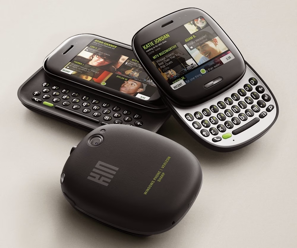
In 2010, Microsoft made an ambitious attempt to break into the highly competitive mobile phone market with the launch of the Kin. The Kin was designed as a social media-centric device, aimed squarely at younger users who lived and breathed platforms like Facebook and Twitter. Unlike other smartphones, which were rapidly becoming more sophisticated with a wide array of apps and features, the Kin focused almost exclusively on making it easier to share photos, status updates, and messages.
The Kin came in two models, the Kin One and Kin Two, both featuring a physical keyboard and a unique design that set them apart from the sleek smartphones of the time. These phones weren’t meant to compete directly with high-end smartphones like the iPhone; instead, they were marketed as affordable, user-friendly devices for the social media-savvy generation.
Marketing Messaging and Press Reception
The marketing for the Kin was laser-focused on the social aspects of the device. Microsoft’s campaign highlighted how easy it was to share life’s moments in real-time, emphasizing features like the “Loop,” a home screen that aggregated updates from social networks, and the “Spot,” a drag-and-drop interface for sharing content. The commercials were colorful, upbeat, and filled with young people enjoying their connected lives, always a few taps away from sharing their latest adventures with friends.
The press, however, was more cautious in its optimism. While some praised Microsoft for trying something different, there were immediate concerns about the phone’s limited functionality compared to other smartphones. Critics noted that while the Kin had some interesting ideas, it seemed like a device stuck between worlds-neither a fully functional smartphone nor a simple feature phone, but something awkwardly in between. Despite these reservations, there was still some curiosity about whether the Kin could carve out a niche for itself in the crowded mobile market.
Market Reception and Reasons for Failure
Unfortunately for Microsoft, the Kin’s time on the market was brief-painfully brief. Just 48 days after its launch, Microsoft pulled the plug on the Kin, making it one of the shortest-lived products in the company’s history. So, what went wrong?
For starters, the Kin was critically overpriced for what it offered. Positioned as a device for teens and young adults, it came with a price tag that was far too close to full-fledged smartphones, which offered far more functionality. This was a major misstep, as the target audience was unlikely to pay a premium for a device that couldn’t even run basic apps like those available on Android and iOS.
Moreover, the Kin required a data plan on top of its already hefty price, which further alienated the budget-conscious demographic Microsoft was trying to reach. Users quickly realized that for a little more money, they could get a fully capable smartphone with access to a broad ecosystem of apps, rather than a device limited to basic social media and texting.
But perhaps the biggest failure was the Kin’s lack of identity. It wasn’t clear who the Kin was really for. It was too limited for power users, yet too expensive for the casual users it was targeting. The social media features, while innovative, weren’t compelling enough to justify the cost or the lack of other essential smartphone functions. Consumers simply couldn’t see the value in the Kin, and sales reflected that indifference.
The rapid discontinuation of the Kin was a clear signal that Microsoft had misread the market. The product was a classic example of a good idea poorly executed, launched without a clear understanding of what the target audience actually wanted-or would be willing to pay for.
The Kin’s failure serves as a reminder that even the most well-intentioned products can fail spectacularly if they don’t align with market needs, pricing expectations, and consumer behavior. In trying to cater to a young, social-media-obsessed crowd, Microsoft ended up delivering a product that pleased no one and cost them dearly in both reputation and resources.
Google Glass
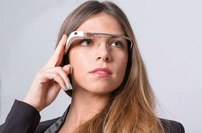
In 2013, Google introduced the world to Google Glass, a futuristic wearable device that promised to bring the power of a smartphone directly to your face. Google Glass was a pair of lightweight, glasses-like frames equipped with a small, transparent display that sat just above the right eye. This display allowed users to see notifications, take photos and videos, access the internet, and use a variety of apps-all without ever needing to pull out their phone. The device also featured voice commands, making it hands-free and seemingly perfect for the on-the-go digital age.
Google Glass was positioned as a cutting-edge piece of technology, heralding a new era of augmented reality where the digital world and the physical world would seamlessly blend together. It was, in many ways, the epitome of Silicon Valley’s vision for the future: sleek, innovative, and, perhaps most importantly, cool.
Marketing Messaging and Press Reception
Google’s marketing for Glass was, fittingly, out of this world. The company released a series of slick, visually stunning videos showing people using Glass in everyday life-navigating city streets, sharing experiences with friends in real-time, even skydiving, all while effortlessly interacting with the world around them. The tagline “It’s like having your hands free, with a little help from Google” captured the essence of the product’s appeal. Glass wasn’t just a gadget; it was a lifestyle statement.
The tech press was initially intrigued, if not outright enamored. Here was a product straight out of science fiction, brought to life by one of the world’s most innovative companies. Early reviews praised its potential, with some even calling it a game-changer for how we interact with technology. However, as the hype began to settle, more skeptical voices emerged. Concerns about privacy, safety, and practicality started to surface, raising questions about whether the world was really ready for Google Glass.
Market Reception and Reasons for Failure
Despite the initial buzz, Google Glass faced a harsh reality once it was released to the public. The device was first made available to select “Explorers” (a group of early adopters and influencers) at a whopping $1,500, a price that immediately placed it out of reach for most consumers. Even among those who could afford it, the actual experience of using Google Glass didn’t live up to the futuristic promise.
One of the biggest issues was social acceptance-or rather, the lack of it. Wearing Google Glass in public quickly earned users the unflattering nickname “Glassholes,” a term that encapsulated the social discomfort and distrust the device generated. The idea that someone could be recording you at any time without your knowledge made people uneasy, leading to confrontations in public places and outright bans in certain establishments. The promise of an integrated digital-physical experience clashed with real-world concerns about privacy and intrusion.
Additionally, the functionality of Google Glass was more limited than many had hoped. The small screen was difficult to see in bright light, battery life was poor, and the voice commands were often finicky and unreliable. For all its promise, Glass felt more like a prototype than a polished product ready for mass adoption.
Moreover, the practical use cases for Google Glass weren’t compelling enough to justify its price or its social stigma. While it had some niche applications-like in medical fields or hands-free professional environments-most consumers couldn’t find a reason to wear a device that made them stand out in awkward, uncomfortable ways.
In 2015, just two years after its debut, Google stopped producing Glass for the general public. The project was officially “paused,” though it was clear that the experiment had failed. Google later pivoted to focus on enterprise applications, where the technology found more success in controlled, specialized environments. However, the consumer version of Google Glass was quietly laid to rest, remembered more for its bold vision than for its actual impact.
Google Glass stands as a testament to the fact that even the most exciting technological innovations can fall flat if they don’t align with consumer needs, societal norms, and practical functionality. It’s a reminder that sometimes, being too far ahead of your time can be as much a curse as it is a blessing.
Segway
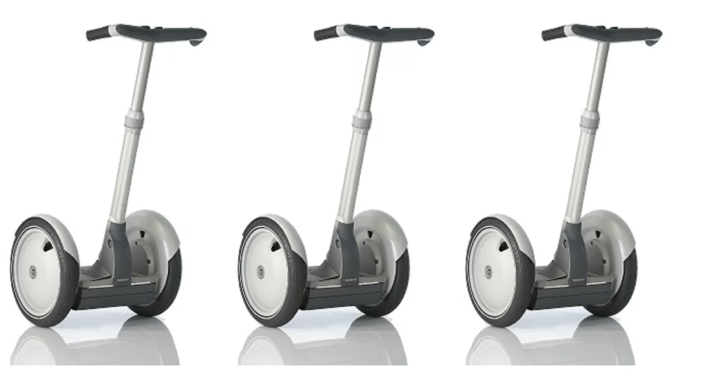
In December 2001, the Segway Human Transporter was unveiled with unprecedented hype. Developed by inventor Dean Kamen, the Segway was touted as a revolutionary personal transportation device that would change the way people moved around cities. The self-balancing, two-wheeled electric scooter was designed to be intuitive to use, responding to shifts in the rider’s body weight to move forward, backward, or turn. It was a marvel of engineering, capable of reaching speeds up to 12.5 miles per hour and traveling up to 24 miles on a single charge.
The Segway was marketed as the future of urban transportation-a clean, efficient alternative to walking or driving short distances. Kamen and his team envisioned cities transformed, with Segways zipping along specially designed lanes, reducing traffic congestion and pollution. The device was sleek, innovative, and packed with futuristic technology, including gyroscopic sensors and advanced software to keep it upright and safe.
Marketing Messaging and Press Reception
The marketing buildup to the Segway’s launch was nothing short of legendary. Before its official unveiling, the Segway-then code-named “Ginger”-was the subject of intense speculation. Tech luminaries like Steve Jobs reportedly predicted that it would be as significant as the personal computer, while others believed it would make walking obsolete. The media buzz was palpable, with leaks and teasers fueling the fire. By the time Kamen revealed the Segway on ABC’s “Good Morning America,” expectations were sky-high.
Once the Segway was revealed, the marketing emphasized its cutting-edge technology and potential to revolutionize urban life. It was pitched as a must-have for forward-thinking cities, businesses, and affluent consumers who wanted to be at the forefront of a transportation revolution. The press initially echoed this optimism, with many journalists marveling at the device’s ingenuity and potential to change the world. However, there were also skeptics who questioned whether people would actually adopt such a novel mode of transportation.
Market Reception and Reasons for Failure
When the Segway finally hit the market, reality didn’t quite match the hype. For one, the price tag was a significant barrier: at $5,000, the Segway was far more expensive than most people were willing to pay for a personal transportation device, especially one that didn’t replace a car but merely supplemented walking or biking.
Additionally, the Segway struggled with practicality. While it was innovative, it wasn’t clear where it fit into daily life. It was too fast for sidewalks and too slow for roads, leaving it in an awkward middle ground. Cities lacked the infrastructure to accommodate Segways, and there were concerns about safety and the potential for accidents, especially in crowded urban environments.
Social acceptance was another major hurdle. The Segway, while technically impressive, looked odd. Riding one made users stand out-and not necessarily in a good way. The sight of someone gliding down the street on a Segway, towering over pedestrians, was more likely to elicit laughter or confusion than admiration. It became apparent that while people admired the Segway from a distance, few wanted to be seen riding one.
Despite its potential, the Segway never became the game-changing product it was intended to be. It found niche applications in places like warehouses, golf courses, and guided city tours, but it failed to achieve mass adoption. The high price, lack of infrastructure, and social awkwardness proved insurmountable obstacles. By the time Segway Inc. was sold in 2009, it was clear that the Segway would not be the transformative product it was hyped to be.
The Segway’s failure is a classic example of a product that was technically brilliant but fundamentally misunderstood its market. It highlights the dangers of believing too much in the power of innovation without considering the practical, social, and economic realities that determine whether a product will succeed or fail.
In the end, the Segway became less a revolution in personal transport and more a symbol of the challenges that face even the most innovative products: understanding not just how to make something new, but how to make something people actually want to use.
BIC For Her Pens
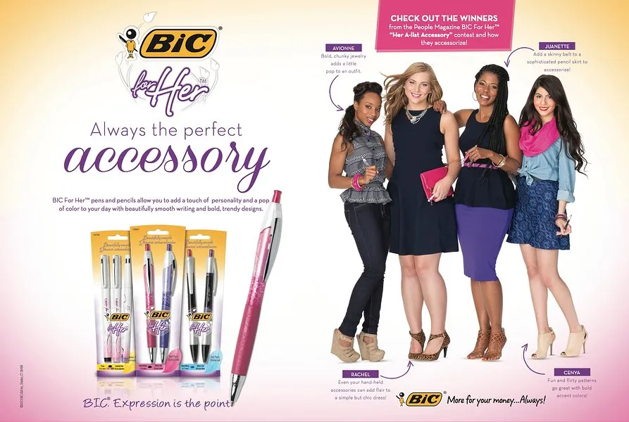
In 2012, BIC, a company known for its affordable and reliable writing instruments, made an eyebrow-raising foray into gender-specific products with the launch of “BIC For Her” pens. These pens were marketed explicitly to women, with design features that were supposedly tailored to female users. The pens were slimmer, lighter, and came in pastel colors like pink and purple. BIC’s idea was simple: women would appreciate a pen that was more “feminine,” both in appearance and in how it felt in their hands.
Marketing Messaging and Press Reception
The marketing for BIC For Her was uncharacteristically specific, emphasizing the pens’ “elegant design” and how they were “designed to fit comfortably in a woman’s hand.” The packaging and advertisements reinforced these ideas, often featuring soft colors, flowing fonts, and imagery that seemed to appeal to stereotypical notions of femininity.
However, the press and the public quickly latched onto the product with a mixture of disbelief and humor. Media outlets and consumers alike found the concept of a gender-specific pen to be laughably unnecessary, if not outright patronizing. The idea that women needed a special pen tailored to their delicate hands struck many as outdated and condescending. The product quickly became the subject of ridicule, with critics lambasting BIC for promoting outdated gender stereotypes.
Market Reception and Reasons for Failure
BIC For Her faced a swift and merciless backlash. Online reviews, particularly on platforms like Amazon, were flooded with sarcastic and biting commentary. Reviewers mocked the pens with over-the-top comments about how revolutionary it was to finally have a pen made “just for women,” or how they struggled to use “normal” pens before BIC’s innovation. One review humorously claimed that the pen was a “dream come true” because it “perfectly matches my kitchen.”
The pens also became a popular topic of satire on social media and late-night talk shows, where comedians had a field day lampooning the idea that women needed specially designed pens. The sheer volume of ridicule and negative press made it clear that BIC had severely miscalculated the market’s response.
The failure of BIC For Her can be attributed to a fundamental misunderstanding of its target audience. Instead of addressing an actual need or providing a meaningful improvement, the product came across as pandering and out of touch. The notion that women would somehow prefer or require a different kind of pen based solely on their gender was not just misguided; it was an insult to the intelligence of the very consumers BIC was trying to reach.
In the end, BIC For Her became a textbook example of how not to approach product design and marketing. Rather than resonating with female consumers, it alienated and amused them, becoming more of a punchline than a successful product. The pens did not last long on the market, and BIC eventually had to face the embarrassment of having created a product that was widely viewed as a misstep in gendered marketing.
The story of BIC For Her is a clear reminder that when companies try to cater to demographics based on outdated or simplistic assumptions, the results can be disastrous. The key to successful marketing and product design is understanding your audience, not underestimating them. In trying to make a pen “for her,” BIC ended up with a product that was for no one.
Coca-Cola C2
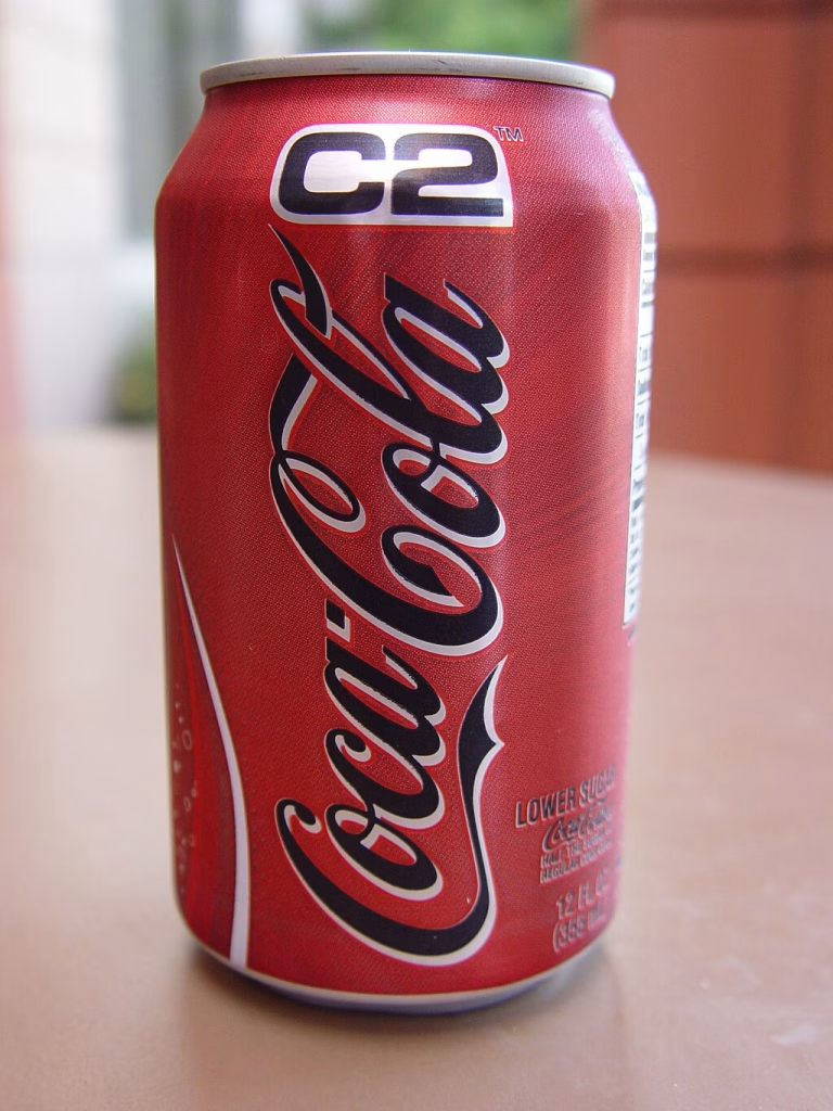
In the early 2000s, low-carb diets were all the rage. The Atkins Diet, in particular, had people everywhere swearing off bread, pasta, and sugar-laden soft drinks. Sensing an opportunity to tap into this health-conscious trend, Coca-Cola decided to introduce a new product that would appeal to those looking to cut calories and carbs without sacrificing the classic Coke taste. The result was Coca-Cola C2, a “mid-calorie” cola that promised to deliver all the flavor of regular Coke but with half the sugar, carbs, and calories.
Launched in 2004, Coca-Cola C2 was positioned as a bridge between Diet Coke and the original Coca-Cola. It was sweetened with a blend of high-fructose corn syrup and artificial sweeteners, aiming to satisfy those who found Diet Coke too artificial-tasting but didn’t want the full calorie load of regular Coke.
Marketing Messaging and Press Reception
Coca-Cola put considerable effort into marketing C2 as the perfect compromise for consumers who wanted to enjoy a soda without the guilt. The company’s ads featured rock music, bold visuals, and slogans like “Half the carbs, half the cals, all the great taste,” clearly targeting young men who might have shied away from Diet Coke, which was often seen as a “women’s drink.” The campaign also emphasized how C2 was a great choice for those following low-carb diets, suggesting that it was the ideal beverage for the health-conscious consumer who still wanted to indulge in the classic cola experience.
Initial press coverage was cautiously optimistic, with some industry analysts praising Coca-Cola for trying to innovate in the highly competitive soft drink market. However, others were skeptical, questioning whether there was really a significant market for a “mid-calorie” soda. After all, consumers already had clear choices between full-calorie and zero-calorie sodas-did they really need something in between?
Market Reception and Reasons for Failure
As it turned out, the answer was no. Coca-Cola C2 was met with a collective shrug from consumers. Despite the heavy marketing push, sales were lackluster, and it became clear that people just weren’t interested in a half-calorie soda. Those who were concerned about carbs and calories were already drinking Diet Coke or other low-calorie options, while those who preferred the taste of regular Coke weren’t willing to compromise for a product that didn’t deliver the full flavor they loved.
The underlying problem with C2 was that it occupied an awkward middle ground. It didn’t appeal strongly to any particular group of consumers. For diet-conscious individuals, Diet Coke or other diet sodas were already well-established alternatives. For those who enjoyed regular Coke, the taste difference in C2-while not as drastic as Diet Coke-was still noticeable enough to be unappealing. In trying to please everyone, C2 ended up pleasing no one.
By 2007, Coca-Cola quietly discontinued C2, recognizing that the product was not resonating with consumers. The failure of C2 is a testament to the challenges of trying to carve out a niche in an already crowded market where consumer preferences are well-established and hard to change.
A Legacy of Flavor Failures
C2 wasn’t Coca-Cola’s first foray into flavor experiments that didn’t quite hit the mark. The company has a long history of trying out new flavors and formulations with varying degrees of success. For instance, there’s the infamous New Coke debacle of 1985, where Coca-Cola attempted to replace its flagship product with a new formula, only to face massive backlash from loyal customers who demanded the return of the original recipe.
Then there was Coca-Cola Black Cherry Vanilla, introduced in 2006, which attempted to combine multiple flavor profiles into one drink but ended up confusing and alienating consumers. And let’s not forget Coca-Cola BlāK, a coffee-flavored cola launched in 2006 that was meant to appeal to the adult market. However, its unusual taste and high price point led to its discontinuation just two years later.
Each of these failures, including Coca-Cola C2, highlights the risks of tinkering with a beloved product and the difficulty of predicting what new flavors or formulations will resonate with consumers. While innovation is crucial in the beverage industry, it’s clear that even the biggest brands can misjudge the market and end up with a product that fizzles out rather than making a splash.
Coca-Cola C2 serves as a reminder that not every attempt to cater to consumer trends will succeed. Sometimes, trying to split the difference between established products results in a product that doesn’t stand out in any meaningful way. In the end, Coca-Cola learned that consumers want choices that are clear and distinct, not products that occupy a vague middle ground.
Juicero
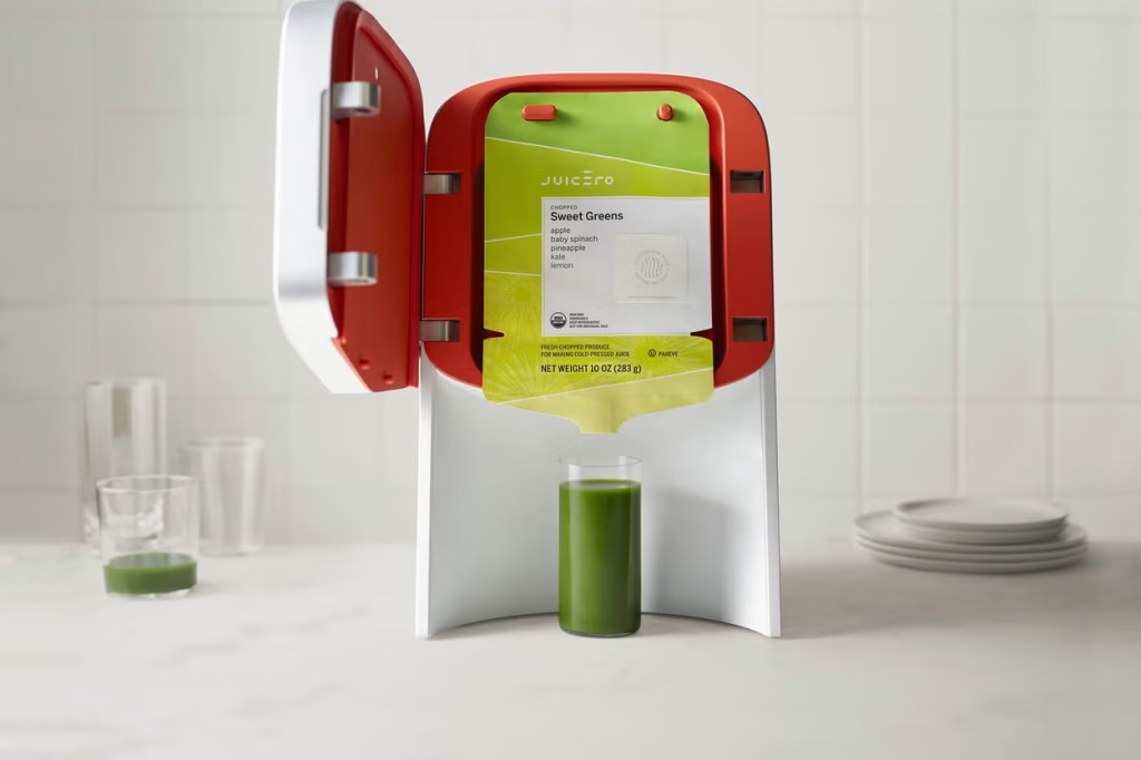
In 2016, Silicon Valley introduced the world to Juicero, a high-tech juicing machine that promised to revolutionize the way we consume cold-pressed juice. The brainchild of Doug Evans, Juicero was designed to be a sleek, Wi-Fi-connected countertop appliance that squeezed juice from proprietary packs filled with chopped fruits and vegetables. These packs, which were delivered directly to consumers, promised fresh, organic juice at the touch of a button-no messy cleanup required.
The Juicero machine itself was a marvel of engineering, featuring over 400 custom parts and delivering a powerful 4-ton press to extract every last drop of juice. The device was also equipped with QR code scanners to ensure that consumers were using fresh, in-date packs, and it would refuse to press a pack if it detected any issues. The whole system was designed to appeal to health-conscious consumers who valued convenience, freshness, and the latest tech.
Marketing Messaging and Press Reception
Juicero was marketed as the ultimate kitchen gadget for the modern, health-focused individual. The company’s messaging centered on the purity and quality of the juice, emphasizing that Juicero delivered a premium experience unmatched by other juicing methods. The ads featured clean, minimalist designs, with images of fresh produce and vibrant juice pouring into pristine glasses. Juicero was presented as more than just a juicer-it was a lifestyle upgrade, promising fresh, organic juice with the ease and elegance of cutting-edge technology.
The press initially responded with curiosity and excitement, with many tech and lifestyle publications praising the innovation behind Juicero. The product was positioned as the next big thing in health and wellness, and there was significant buzz around its potential to disrupt the traditional juice market. However, this enthusiasm was tempered by the product’s hefty price tag-the Juicero machine launched at $699, with juice packs costing between $5 to $8 each.
Market Reception and Reasons for Failure
Juicero’s downfall began when a critical flaw in its business model was exposed: you didn’t actually need the $699 machine to get the juice. In 2017, Bloomberg published an article revealing that the juice packs could be manually squeezed by hand, yielding nearly the same amount of juice as the expensive machine. This revelation quickly went viral, turning Juicero from a symbol of innovation into the butt of jokes about over-engineered, overpriced gadgets that solved problems no one really had.
The backlash was swift and brutal. Consumers who had already been skeptical of the price were now openly mocking the product, and the notion that Juicero’s machine was a necessary part of the experience became laughable. The idea that a $699 device could be replaced by simple hand pressure completely undermined the company’s value proposition. Juicero’s carefully crafted image as a high-tech, must-have appliance crumbled almost overnight.
Additionally, the high cost of both the machine and the juice packs limited Juicero’s appeal to a very narrow market segment. Even among health-conscious consumers, there were far more affordable and practical ways to enjoy fresh juice. The product’s reliance on proprietary packs also meant that consumers were locked into a continuous cycle of purchasing expensive, single-use items, further diminishing its appeal.
Within months of the Bloomberg report, Juicero’s sales plummeted, and the company’s reputation was irreparably damaged. In September 2017, just 16 months after its launch, Juicero announced that it was shutting down operations and offering refunds to customers.
Juicero’s failure is a cautionary tale about the dangers of overengineering a product and overestimating the market’s willingness to pay for convenience wrapped in unnecessary technology. The company’s focus on creating a high-tech solution for a problem that didn’t exist-juicing packs that could just as easily be squeezed by hand-led to its rapid demise.
Juicero’s story serves as a stark reminder that innovation for innovation’s sake is not enough. A successful product needs to solve a real problem in a way that justifies its cost, both in terms of money and convenience. When a product fails to deliver on its promises-or worse, when it’s revealed that its key selling point is effectively irrelevant-it’s only a matter of time before the market responds with a collective thumbs down.
Dodged Bullets: The Products That Never Made It Past R&D

As we’ve seen throughout this article, the road from concept to market is paved with good intentions-and more than a few spectacular flops. But for every Windows 8 or Juicero that makes it into the hands of consumers, there are countless other products that never see the light of day. Why? Because sometimes, just sometimes, companies manage to pull the emergency brake before they drive off a cliff.
Welcome to the Hall of Could-Have-Been Disasters-the products that were wisely shelved during the R&D phase after user testing and market research sent up more red flags than a bullfighting arena. These near-misses show that, occasionally, the system works, and listening to what consumers actually want (or don’t want) can save a company from adding another name to the roster of epic failures.
The Apple Pippin II: An Apple That Never Ripened
After the not-so-sweet success of the original Apple Pippin, Apple briefly flirted with the idea of a sequel-because what better way to follow up a flop than with a sequel, right? The Apple Pippin II was meant to be a sleeker, more powerful multimedia console that would finally give gamers and tech enthusiasts what they wanted. But here’s the kicker: internal testing and market research revealed that nobody actually wanted it. Consumers were already confused by the Pippin’s identity crisis, and the sequel wasn’t likely to fare any better. Apple wisely pulled the plug before this ill-fated fruit had a chance to fall from the tree, choosing instead to focus on products with more bite-like, oh, I don’t know, the iPhone?
Microsoft Courier: The Notebook That Never Opened
Imagine a digital journal with two screens, a stylus, and all the creativity you could possibly pack into a notebook-sized device. That was the Microsoft Courier-a concept so cool it had even the most jaded techies drooling. But here’s the twist: when the team dug into the details, they realized this nifty gadget didn’t fit anywhere in Microsoft’s grand scheme. It wasn’t quite a tablet, not exactly a computer, and way too different from the familiar Windows experience. Consumer feedback suggested it was the gadget equivalent of a one-hit wonder-cool, but not worth committing to. Microsoft quietly shelved the project, redirecting their energy towards what would eventually become the Surface, a much bigger hit in the tech world.
Project Ara: The LEGO of Smartphones That Never Stacked Up
Google’s Project Ara promised to be the smartphone equivalent of LEGO-modular, customizable, and endlessly tweakable. Who wouldn’t want to build their phone piece by piece, upgrading only the parts they needed? Well, as it turns out, most people. Research showed that while tech enthusiasts loved the idea, the average consumer just wanted a reliable phone that worked out of the box, without the hassle of assembling components like a digital IKEA kit. Plus, there were concerns about durability and practicality. Faced with this reality check, Google decided to pack away the blocks and leave the modular dreams for another day. Project Ara never saw the light of retail, but it remains a fascinating “what if” in the annals of tech history.
Coca-Cola’s Stevia Experiment: A Bittersweet Endeavor
Before Coca-Cola Life’s green label hit store shelves, the soda giant toyed with an all-stevia version-because who wouldn’t want a cola that’s sweet and guilt-free? Turns out, a lot of people. Consumer testing revealed that the taste was…well, not quite the sweet symphony Coca-Cola was hoping for. Instead, it was more like a bitter ballad that left a bad taste in testers’ mouths-literally. Realizing that a stevia-only soda wasn’t going to win over taste buds, Coca-Cola wisely blended stevia with sugar to create Coca-Cola Life. The final product wasn’t a blockbuster, but it sure beat the alternative-a cola that fizzled out before it even hit the market.
Nike MAG Self-Lacing Shoes (First Attempt): More Trip Than Slip
Before the world was introduced to the futuristic Nike MAGs in 2016, there was an earlier attempt to bring self-lacing shoes to the masses. Inspired by the “Back to the Future” films, Nike’s first prototypes were bulky, expensive, and prone to mechanical mishaps. User testing quickly turned up some major issues: the shoes were uncomfortable, the lacing mechanism wasn’t reliable, and nobody wanted to pay a small fortune for what amounted to a novelty item. Nike wisely shelved the first iteration and went back to the drawing board, eventually releasing a sleeker, more limited-edition version that became a collector’s dream.
Google Glass Enterprise Edition (Consumer Version): The One That Stayed in the Lab
After the public gave a collective thumbs-down to the original Google Glass, Google considered a second round aimed at consumers. But as they say, fool me once, shame on you; fool me twice, shame on me. This time, Google dug deep into user research and discovered that the problems that plagued the first version-privacy concerns, social stigma, and a lack of killer features-were still very much alive. Rather than risk another flop, Google pivoted to focus on the enterprise market, where Glass found a more welcoming home in professional settings. The consumer version was left on the cutting room floor, avoiding a sequel that nobody was asking for.
Conclusion
These stories serve as a crucial reminder that sometimes, the best product is the one you don’t launch. Through careful market research, user testing, and a willingness to listen to what the data is saying, companies can avoid the costly mistakes that have sunk so many others. It’s a lesson as old as business itself: know your audience, understand your product’s place in the world, and never underestimate the value of a well-timed course correction.
And this is where tools like iMotions Lab come into play. By measuring real-world reactions and digging into the nuances of consumer behavior, companies can get the insights they need to make these tough calls-before a product ever makes it to market. It’s all about catching the flaws early, fine-tuning the design, and ensuring that when you do finally launch, you’re launching a winner, not the next Juicero.
So, the next time you’re dreaming up the next big thing, remember these near-misses. Because sometimes, the smartest move is knowing when to walk away.
In the end, the common thread through all these product failures and near-misses is the importance of aligning innovation with practicality, listening to consumers, and doing your homework before you hit the market. It’s a delicate balancing act, but with the right approach-and the right tools-you can avoid becoming the next cautionary tale. So, here’s to innovation that works, products that people actually want, and market launches that go off without a hitch. After all, the best ideas are the ones that make it out of the lab and into the world, where they belong.
For an exploration into product failures, be sure to visit The Museum of Failure. Their assortment of unsuccessful products guarantees both amusement and enlightenment. As Henry Chesbrough once stated: Most innovations fail. And companies that don’t innovate die.
Let’s talk!
Schedule a free demo or get a quote to discover how our software and hardware solutions can support your research.
iMotions Sensory and Consumer
Research Services
Whether you require a full-service research project, partial research services, or specialized data analysis, our team of experts is ready to assist you.
We carry out tests for


