Making the best decision when purchasing products on the internet can be a dizzying process – there are a countless number of shops, each offering different deals in different ways. The variations can be related to the product price, the shipping costs, return policy, delivery times, and more.
Filtering through and deciphering which website offers the actual best deal for you can therefore be tricky – it’s easy to end up buying a cheap product with expensive shipping that has a poor return policy, rather than the best possible deal. Clearly the current process doesn’t work optimally if you can end up paying more and receiving less at some stores relative to others.
Websites that make this simpler for consumers can not only benefit from highlighting how attractive their offer is, but also from having less frustrated consumers. The task at hand then becomes how to make this information more easily and conveniently accessible to consumers. What can be changed about the current shopping experience to ensure that the consumer receives all the information that they need?
The Background
Through work with the Danish Competition and Consumer Authority (DCCA), we tested a new proposed way of displaying online shopping information that is often hidden in the terms and conditions (T&Cs).
Product pages often just show the product with some information, and when the product is selected, the delivery costs are added on and the T&Cs are agreed to without being read. The DCCA wanted to change that, and proposed a simpler, more transparent format for displaying the information that could be crucial to your purchases.
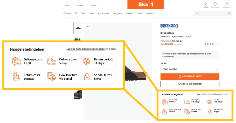
While it’s relatively straightforward to suggest a new system and claim that it would improve things, this doesn’t provide any clear answers to whether the system actually helps, or how it does so. It’s all well and good to have a new system, but to empirically test it is another – the results provide real answers and can provide insights into what works, and what doesn’t.
The Hypotheses
The study set out to test whether or not the new system of displaying the T&Cs was beneficial to consumers. Specifically, it examined whether:
- Consumer presented with the simplified terms of purchase use the terms more actively when comparing similar products from different suppliers
- Consumers presented with the simplified terms of purchase have a better understanding of the terms and conditions for delivery and returns
Simple observation (common in UX research) would struggle to provide definitive answers to these questions – following the path that consumers take through the website would only provide a shallow understanding of the shopper experience. Sensors for studying the visual attention, and emotional expressions can provide data that is more relevant, direct, quantifiable, and objective.
The Methods
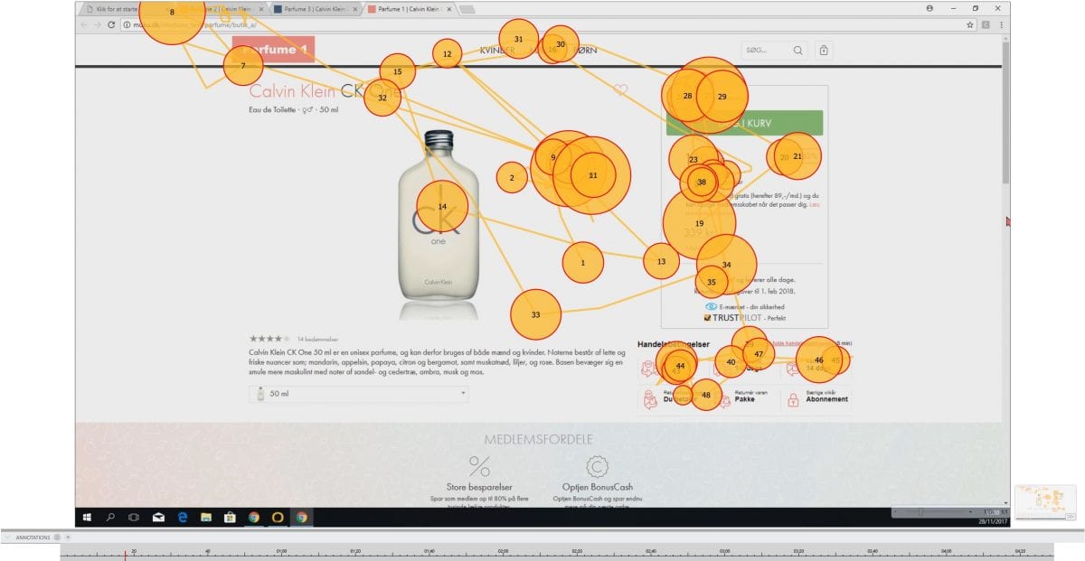
The study used eye tracking to observe the visual attention that was given towards the new T&Cs – to see what was seen, and what wasn’t. Facial expression analysis was also used to assess the emotional expressions that the participants exhibit throughout the process – to indicate if and how the different shopping experiences elicited any external changes in emotions.
The T&Cs were varied not just in how they were displayed, but also in their contents across each webshop. This provided information about how well the participants remembered the information as well as tested how it impacted their purchasing behavior.
For example, one of the webshops for the wine priced the product at $25, with a delivery price of $10 (totaling $35), while one of the other webshops priced the same wine at $27 but with free delivery (and both had the same delivery times). Clearly, if the consumer is well-informed about this, and everything else is constant, the latter webshop has the better deal.
Measuring how many people choose the better deal in this context, therefore, presents a naturalistic way of determining how informed the participants were.
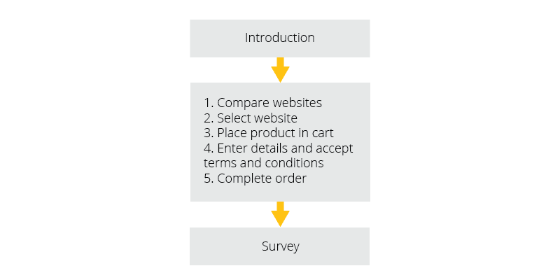
Over a hundred participants were recruited for the study, split into two groups – one of which viewed the new T&Cs, and one of which viewed the current T&Cs. The participants were sat in front of a computer monitor, with the calibrated eye tracker, and a webcam recording facial expressions. After giving consent and reading the study instructions, the experiment began.
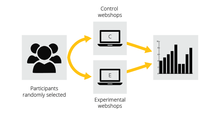
The webpages were designed to offer the worst T&Cs with the cheapest products, while the best T&Cs were associated with the middle-price range products. A final option was also available that had neither the cheapest product nor the best T&Cs (a so-called “decoy” option). After each test, the participants were asked if they had noticed the T&Cs, and how much the T&Cs factored into their decision.
Each participant browsed three websites for a product, repeating this process for three different products (wine, shoes, and perfume) in total.
Results
The results showed that not only were the simplified T&Cs associated with a better understanding and more beneficial consumer choices, they also showed how this happened.
One of the most important results to come from the study was the finding that the participants were more likely to choose the least expensive purchase of wine (i.e. once shipping was included), when the simplified T&Cs were shown.
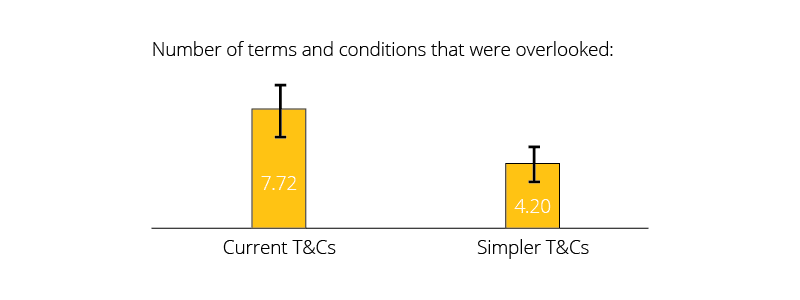
The surveys also further confirmed the hypotheses – the participants remembered more of the crucial information regarding the product, despite not being aware that they were going to be asked this later.
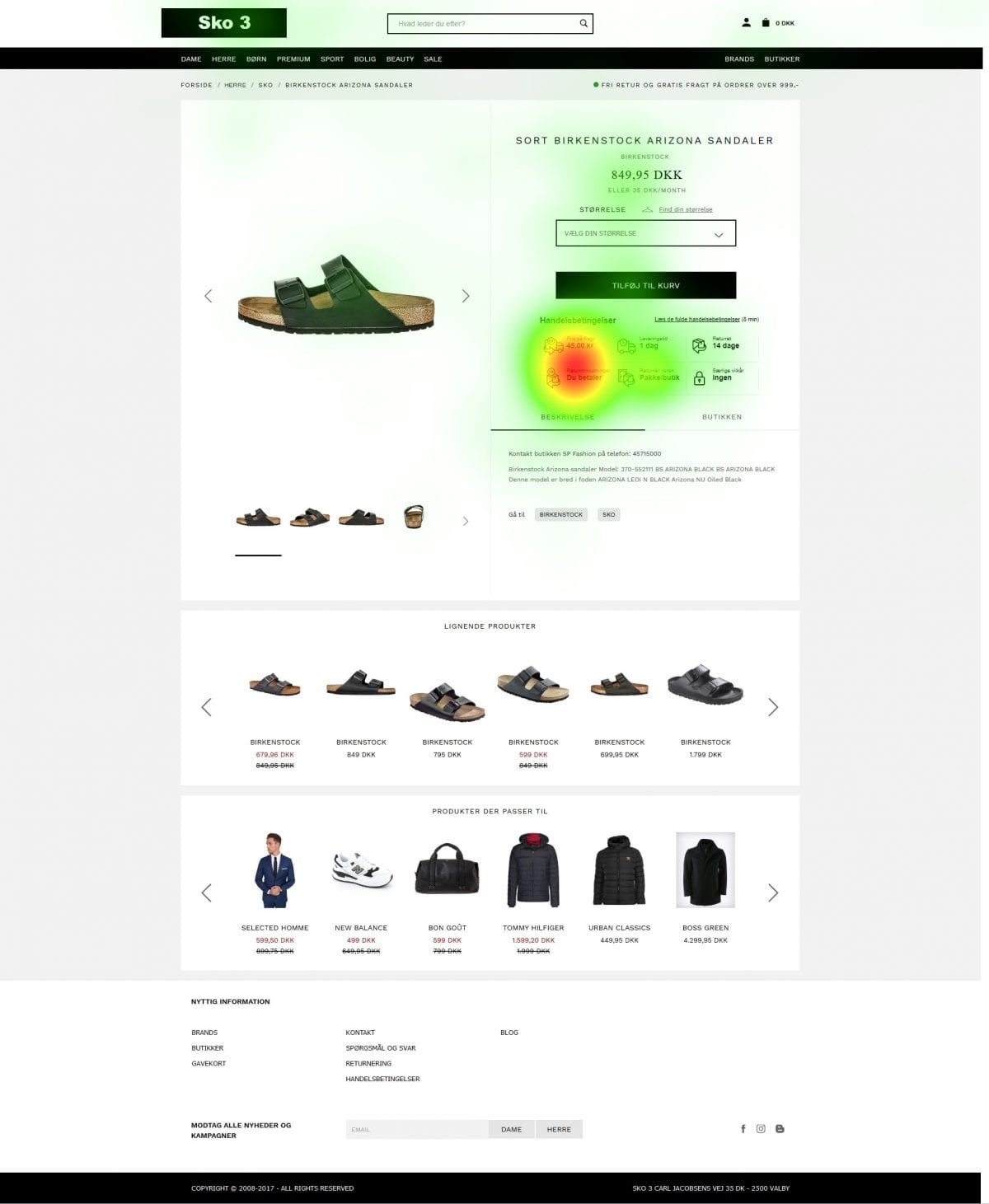
The eye tracking data showed that the participants attended more to the area of the simplified T&Cs, suggesting that this information was more readily available to them. The participants were also quicker at visually attending to the relevant information, when asked questions about the specific T&Cs of the deal – they found what they needed to more quickly with the new display.
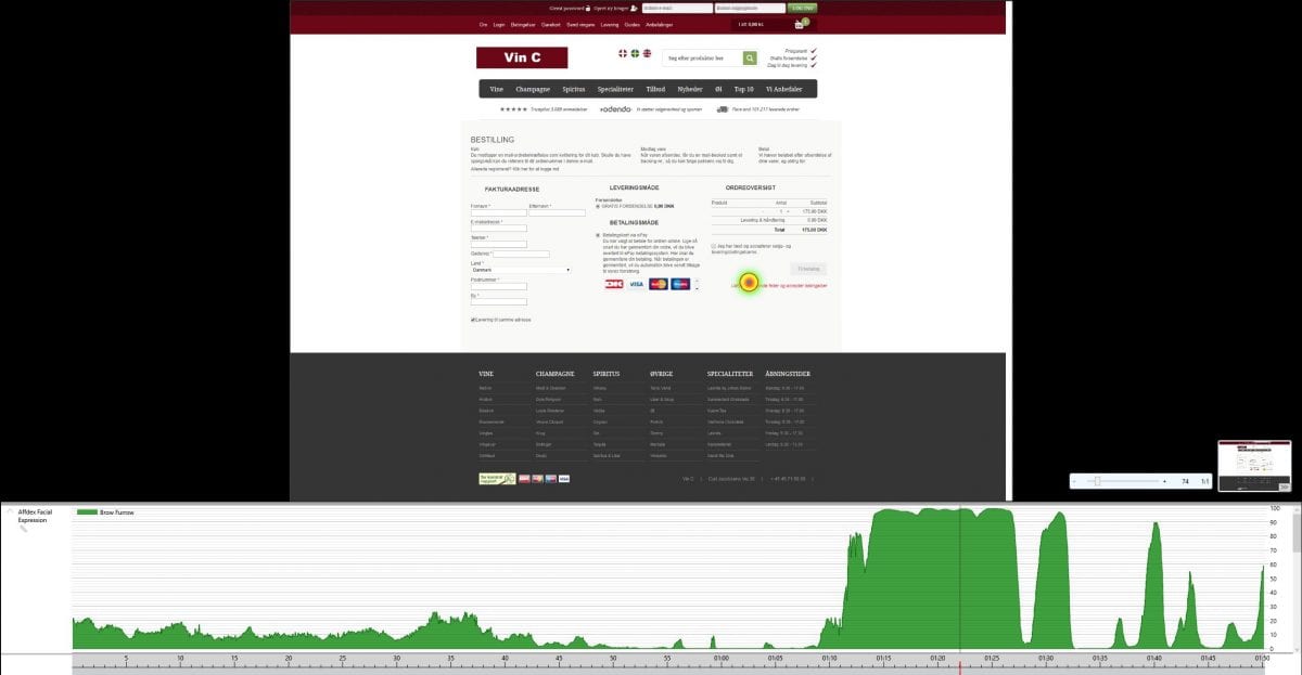
Facial expression analysis also showed that there was less instances of “brow furrow” when participants were searching the simplified T&Cs, suggesting that they generally less frustrated relative to participants who searched the non-simplified T&Cs. This is important as it implies that the new T&Cs would be more suitable for implementation – something that was clearer to read but also more frustrating would likely just be ignored in the long term.
Conclusion
The study was able to show that simplified T&Cs were able to improve the shopping experience of consumers – not just by asking them afterwards about their thoughts, or tallying who bought what – but by providing concrete, actionable data that points towards a new way for webshops to operate.
The eye tracking data could show that the participants were quicker at identifying the information they needed, and quantify that difference. Having objective data means that the suggested improvements don’t just rely on subjective opinions, but reliable data.
The facial expression analysis provided information about emotional expressions – an aspect that is often difficult to reliably quantify. This is particularly evident when the study doesn’t reveal what is actually being tested – asking explicitly what the participants thought of the new terms & conditions would surely skew and bias opinions – gathering non-consciously generated facial expression data provides a more objective basis for judging emotional reactions.
Overall, the study showed that the new design was an improvement upon the old. The conditions were clearer and the participants had a better understanding of their purchases. The eye tracking and facial expression analysis data backed this up, and showed how this came to be. All of this goes to show that the more informed you are, the better – with both purchases, and even website design about the purchases.
If you’d like to learn more about how iMotions can help you with your study design and execution, click here to reach out and discuss further with our in-house expert team.


